Author Archives: Jessica Granish

Warning: Facebook will be Deleting Photos from Your Facebook Account and you may not even know it!

As of July 7th, 2016, Facebook will be deleting many of the photos you took using a smartphone unless you swap to its new Moments picture sharing service and anyone who used Facebook’s ‘syncing’ feature is at risk.


woman-638384__180The function stored all the pictures taken on a smartphone in a special private folder, so users could decide whether to share them publicly at a later date or just store them for their own personal keeping.

The only way to keep them is to download the new Moments app, which collects pictures based on when they were taken and who is in them. The social network began notifying users that it would soon delete all their synced photos if they did not install the app, which was released in June 2015.

The process actually started in January when Facebook discontinued support for automatic syncing of photos from the main Facebook app, forcing users to install the Moments app should they wish to continue automatically uploading their photos.

hands-1167617__180Rest assured though, the removal of the synced photos won’t affect any photos or videos shared on Facebook separately from the synced album, while users are being given the chance to download the photos before they are deleted to those that are synced. Actually, Facebook recently did a very similar thing with its Messenger app by removing chat from the main Facebook app and forcing users to install the Messenger app to keep sending Facebook instant messages.

These changes help Facebook by giving them other platforms to endorse and promote which in turn builds their name along with new apps that are now showing a rise in users such as the Messenger app and soon the new Moments app. Nonetheless, if you love your selfies, you should probably make sure they are saved permanently on your computer especially if you don’t fancy using Moment.

Anyone who’s used Facebook’s auto sync feature in the past has until July 7th to download Moments or a zip file of their synced photos. Otherwise, they’re going to disappear.

Not sure if you have any synced photos to be worried about, Facebook actually sent out an email to all its’ users telling them they are getting ready to retire the “synced photos” feature and in order to save them you must download and use the new Moments app.
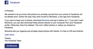
fb sync 1

“Synced photos” is a feature that you had to take the time to turn on and it would sync the photos on your phone with Facebook in a private album. If you never turned it on, you have nothing to worry about. Facebook will not be deleting any photos you’ve shared with friends in albums or uploaded to your timeline. If you deleted the message from Facebook or never remember getting one it can be tough to know just how many photos will be deleted. However, there is a pretty easy way to see how many of your “synced” photos are at risk of being deleted.

First, make sure you’re logged into your Facebook account, then go to: https://www.facebook.com/photos. Now, look above your photos for a link that says “Synced from Phone” and click that. If you don’t see a link for “Synced from Phone” then you never used the feature and you don’t have to worry about this.
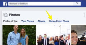
fb sync 2

Look for the link that says “delete them permanently” and click that. (Don’t worry, it won’t delete them instantly)
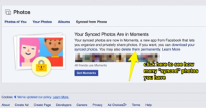
fb sync 3

Then you should see a popup window with a count of the photos that have been “synced” to your account.
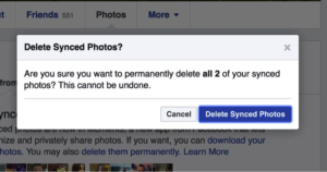
fb sync 5

Facebook should then show you the actual photos you have synced so you can make an informed decision as to whether you need to download Moments to save them but they don’t.

Therefore, from here you have two decisions to make – you can follow the other link to “download your synced photos” and toss them into your other backup service like Google Photos/iCloud or you can download the Moments app to actually see the pictures in question.
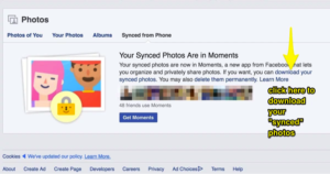
fb sync 6

If it’s a low number I suggest just using the download link but if it’s a larger amount of pictures and you want to see which ones are at risk of deletion you probably want to download the Moments app.

While users will be able to save their photos if they wish, the forceful methods used by the social media network has drawn criticism from users, with claims that Facebook is using its enormous leverage to force users to install its apps.

10 Hidden Gems in Facebook Personal Pages

Facebook is a fantastic invention-you already love it, but there’s a lot hidden beneath the surface. We’ve dug deep into Facebook to find the top 10 hidden secrets.

  1. Message Requests

Not every message that’s sent to you on Facebook shows up in your inbox. Messages sent by someone you are not friends with on Facebook go into a “message request” section.

To access these, click the chatat the top right of your screen. Then click “message requests” (to the right of “recent”).

  1. Save Button for Posts

Sometimes we find great content on Facebook . . . right when we have the least amount of time to actually read it. Never fear-the save button is here! The save button allows you to privately save links to read later.

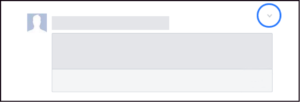
If the post you want to save popped up on your news feed, simply click the to the right of the post and click “save”.

fb block

If you’re viewing the post from a page, click … and click “save.”

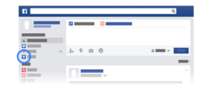
To view your saved posts, go to the left menu and click “saved” (or you can go to Facebook.com/saved).

fb block 2

When you want to delete a post, go to the “saved” posts section. Click “archive” at the top and click next to the post you want to remove, then click “delete.”

  1. Download Copy of FB Data

It’s no surprise that Facebook stores a lot of data on its consumers—A LOT. While you can’t stop Facebook from storing this data, you can access it (or at least some of it). Facebook allows users to download their information, which includes information you can see by using your account (such as posts you share and your activity log) and information you cannot see from your account (such as ads you’ve clicked on and IP addresses that are logged when you use Facebook).

Facebook provides a long list of what types of data is available in the downloaded information (which you can access here: https://www.facebook.com/help/405183566203254) but there are a few key subjects that may be of the most interest to people: searches you’ve made on Facebook, removed friends, pending friend requests, any friends apps or pages you’ve hidden from your news feed, list of people who follow you, and a list of topics that you may be targeted against based on your status likes interests and other timeline data.

To download the information, go into your settings section. Click “download a copy of your Facebook data” below your general account settings. Click “start my archive.” Depending on how long you have been on Facebook and how much you post, it may take a while, but they will email you when it is ready for you to view.

  1. Adding a Legacy Contact

While it’s uncomfortable to think about, it’s important to decide what you want to happen to your Facebook account when you pass away. Facebook provides two options: delete your account permanently or leave up the account and allow loved ones to share memories on it. For the later, you’ll need to designate a legacy contact. They’ll be able to write a pinned post (which can be used to provide memorial service information or share a message on your behalf), accept new friend requests from loved ones, and update the profile picture and cover photo. They will not be able to remove any friends, read your messages, change or remove past posts, or actually log into your account.

To add a legacy contact, log into your settings and click “security” and then “legacy contact.” Type in your designated contact’s name and click “add.” If you later decide you want to change the contact, you’ll be able to click on the contact and click “remove.” Then you can add your new legacy contact.

It’s difficult, but important, to think about what will happen when you pass on. If you run a business, be sure to check out our post on how to prepare your business for an unexpected life crisis: link to post here.

  1. Edit Ad Preferences

Ads can be annoying. Ads that relate absolutely nothing to your life or preferences are even more annoying. Fortunately, Facebook allows you to edit your ad preferences. Simply click (www.facebook.com/ads/preferences/edit/). The link will bring you to a page listing topics and sub-topics that Facebook picked based on your activities on and off Facebook. You’ll be able to delete irrelevant preferences, as well as add preferences from a set list of topics.

  1. Send and Receive Money Through Facebook

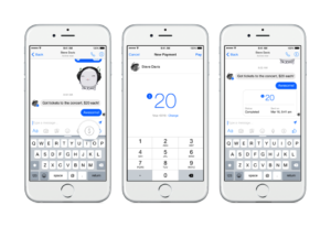
Yes, you read that right. You can now send money to people through Facebook Messenger without a charge! First, you need to add a debit card. Click “settings,” then click “payments,” then click “add new debit card.” Currently, the only way to pay through Messenger is debit. You can also add a PIN if you wish for an extra security measure (click “settings” then click “payments” then click “PIN”).

Once your debit account is activated in Messenger, you’re ready to send money. Create a message and click the $ icon and enter the payment amount. Click “pay” in the top right to send it.

fb block 3

To receive money for the first time, open the conversation and click “add card” in the message to add your debit card.

Just like with other transfers, it may take up to three business days for the banks to make the funds available.

  1. Embedding Posts

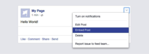
Did you know you can embed public Facebook posts onto your website? It’s simple and a great way to add visual content to your site. First, navigate to the post and click “embed post” from the drop down menu.

fb block 4

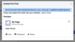
A box will pop up with a code, which you will need to copy and paste into your website.

fb block 5

Embedded posts are a great way to post testimonials, include examples, quote sources, show off your best content, and more!

  1. Friendship Pages

This feature was developed during a Facebook Hackathon. It is basically a timeline, but for a relationship instead of one person. It gathers all the communication (posts, replies, tagged photos, etc.) that involve you and a friend you choose, and places it all in the Friendship Page. You can view these posts, and even personalize the cover photo and profile picture.

To access the page, go to your friend’s profile and click and select “see friendship” from the dropdown.

  1. Play Chess With a Friend Through Messenger

Who doesn’t love a competition of intelligence and strategy between friends? Simply type “@fbchess play” into a conversation with a friend and Messenger will bring up a game of chess. To move type in the phrase “@fbchess” followed by the letter of the piece (K for king, Q for queen, B for bishop, N for knight, R for rook, and P for Pawn) and the letter and number of the location‑For example, “@fbchessPe4” would move a pawn to square E4. If you get confused, type in “@fbchess help.” If you wish to end a match, type in “@fbchess resign.” To pick which color to start with, type “@fbchess play white” or “@fbchess play black” (white goes first).

  1. Play Basketball With a Friend Through Messenger

Maybe chess isn’t your thing. How about a friendly basketball competition? Simply send a friend a basketball emoji and then click on the sent image to begin the game. The scores will be logged in the message feed so you can brag (or listen to bragging) easily.

To play the game, flick up on your phone to launch the ball into the hoop and try to get as many in as possible.

Facebook for personal use offers hours of endless entertainment, from dominating at a basketball game to reminiscing over old memories when viewing the Friendship Page. Facebook is a great tool for businesses as well. If you’d like help utilizing the benefits of Facebook for your business, simply call us or email us today! We are here to help with any aspect of business building, including social media marketing through Facebook.

Facebook Removes the 20% Text Rule

To the joy of marketers everywhere, Facebook finally altered the 20% text rule! This recent change will provide more flexibility and freedom to marketers, while likely impacting the ad experience for Facebook users. Below we break down some common questions about this recent change.

What was the rule before the change?

20%Previously, Facebook rejected ad requests where more than 20% of the image contained text. This caused frustration among marketers whose ads were rejected for containing just barely too much text, and for brands whose logo was text. Some arguably creative and effective ads were also rejected due to containing too much text.

Why did this rule exist if it caused so much frustration?

Facebook, as it repeatedly claims, is all about the user experience. Part of the user experience is the appearance and feel of the timeline. The line of thinking from Facebook went something like this… if ads appeared on timelines containing massive amounts of text, the timelines would appear cluttered and users would be less satisfied with the look of their timelines. Preventing advertisers from using too much text also helped push advertisers to make more creative ads that focused on “showing” rather than “telling,” since you rely on words to “tell.”

So with this change, can I now use as much text as I want on ads?


carrots-673201__180Marketers are now given the option to use photos in their ads that contain more than 20% text. No longer will beautiful ads be rejected for containing just a little bit too much text-marketers rejoice! The new change means Facebook will not stop advertisers from using an image simply because of an abundance of text (other restrictions, such as inappropriate images, still apply). However, Facebook still is pursuing the user experience as the priority. While it removed the “stick” form of motivation (punishing users for ads with too much text by preventing those ads from being published), it simultaneously implemented a “carrot” approach of motivation (providing an incentive to still use ads with minimal text). So even though it may not be a requirement, they still are going to make sure marketers keep limiting text at the top of their minds.

So, why would I still want to use ads with minimal text?

First, ads with too much text are not visually appealing. They make the photo appear cluttered and busy, two things you want to avoid because viewers will likely skip over it. Of course, there are exceptions where the cluttered and busy look is used to make a creative point, but generally speaking it’s a good idea to limit text from a graphic design standpoint.

thumbs upSecond, using too much text will negatively affect the amount of people who see your ad. Facebook has said that, given the same budget, ads with more text will reach a lower number of individuals than ads with less text. Hence the carrot again. They will motivate you to do what they like by giving you more views. Facebook won’t stop you from using too much text, but it makes it clear it is in the best interest of the marketer to continue using minimal text.
How will I know if my ad still uses too much text?

Images uploaded for ads will be placed into one of four categories. The one marketers should aim for is “image text: OK” because it will see no negative impact on reach. These photos contain no or minimal text. The next category “image text: low” sees a slightly limited ad reach. The third category “image text: medium” may see limited ad reach. The fourth category “image text: high” may not even reach the intended audience at all. When advertisers upload a photo in the grid tool, Facebook will let the user know which category the photo falls into.


Pros and Cons of the Facebook’s Redesigned Like Button

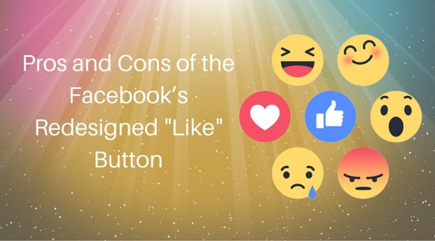
You’ve probably noticed by now the new lovable little emojis popping up on your Facebook feed similar to the “like” button. It’s part of a significant redesign of Facebook’s iconic “like” button to provide users with a variety of quick empathetic responses.

Users can still use the traditional “like” button if they wish, but can also choose “love,” “haha,” “wow,” “sad,” and “angry” buttons. Simply hover the cursor over the “like” button and these options will pop-up.

If you are working on a mobile device, you have to just hold the “like” button and the options pop up.Like thumbs up

While this offers more options for consumers and casual Facebook users, what do these mean for a business’ social media? Will these provide any benefit for the businesses, or will it actually hurt a business trying to see more engagement or comments? It’s too early to tell whether this will be overall beneficial for businesses, but below are some pros and cons of this Facebook change:

PROS

  1. The emojis provide an easy way for audiences to engage with organizations, and it provides
    a bit more emotion. As usage rates of social media on mobile devices increase, ease of use is becoming increasingly important for online consumers. Individuals may not go through the hassle of typing out a comment on a phone, but may take a few seconds to respond with an emoji that offers them a variety of ways to express themselves.
  2. The emojis provide more ways for audiences to engage with organizations in a customizable way. Granted, the “like” button is an effective tool to express a positive reaction toward a post or show support for the idea within the post. However, there’s a lot it cannot do. The introduction of more responses allows audiences a variety of empathetic responses, which in turn can provide organizations more insight into the minds of their audiences.
  3. The number of emojis is small enough to empower engagement while avoiding overwhelming audiences. The paradox of choice, backed by research by psychologist Barry Schwartz, argues more options can overload people and result in their choosing to not make a choice or regret the choice they did make. Other social media platforms offer so many emoji options that many people end up not choosing any of them. Having six options is enough to provide the benefits of freedom of speech and autonomy that audiences love without the drawback of reducing audiences’ decision making ability.

CONS

  1. The emojis increase the difficulty of an already difficult aspect of social media marketing: measurement. It’s hard for marketers to know what, and how, to measure social media efforts and ROI. Introducing more variables to measure makes those decisions of how to approach analytics more challenging, and raises new questions to answer—for example, should a “love” count the same as a “like”? And is angry a good thing? Is someone showing the emotion of anger against your post, or supporting the post if it is a negative tone-as in it also makes them angry?
  2. The emojis may actually reduce engagement. It’s great that people may use the “like” button given the added options, but at the same time people may choose to use emojis over commenting. By providing audiences the opportunity to say more with less words, audiences may in turn end up simply using less words in general and decrease the amount they provide valuable audience insight through commenting.
  3. More options for engagement mean more data the Facebook algorithm can collect. This isn’t necessarily inherently a bad thing, but it could be a drawback if the data is used to determine how many people see your business post. While it’s not certain yet how Facebook will use that new data, it’s possible businesses whose audiences don’t utilize the emojis could see a drop in reach and engagement.

People have asked Facebook for a “dislike” button for years, and this is their response. Right now, it is new and exciting, but time will be the judge on how well this new engagement works, and more importantly, how it impacts the business side of Facebook. We do know that this will impact the field of social media marketing and the numerous organizations relying on social media for advertising, whether it will be a positive impact is left to be determined.

If the thought of trying to understand and master yet another drastic change to social media makes your head spin, don’t fret! Alpine Small Business Solutions is here for you. We can handle your social media marketing, or any other aspect of business building you would like assistance with. Just shoot us an email or call us up.

6 Differences Between Facebook Ads Manager and Power Editor and How to Navigate them.

asbs blog pic

What? You didn’t even know you had options? Facebook offers two great tools to create ads: Facebook Ads Manager and Power Editor. Both can serve your marketing needs, but they both offer unique benefits and challenges, as most options you find out there will. Below are some of the key differences between the two tools. Facebook Ads Manager is the default tool, while Power Editor is a free download that is optimized for Chrome, using this tool in other browsers should be avoided.

Here’s what you should know:

Difference 1. Who are you talking to?

Your target audience is a big factor when you are working on making your ads. You want to make sure you are speaking to people who will make it worthwhile for paying for you your ad.

Facebook Ads Manager is the default tool, which means it’s more basic so it can be more user friendly. Anyone from the most experienced marketer to the average Joe freelancing on the side can use the tool to easily create, manage, and analyze ads. Power Editor is the more advanced tool, specifically created for larger businesses intending on creating and tracking many ads at once. Which tool you choose will be impacted by your advertising experience level and size of your marketing budget.

The layout of the pages reflects the target audience, with Facebook Ads Manager more simple (but with less options) than the Power Editor.

Figure 1 Facebook Ads Manager Screen

Figure 1 Facebook Ads Manager Screen


Figure 2 Power Editor

Figure 2 Power Editor


Difference 2. Isn’t always about the toys?

Many new advertising features are tested first on Power Editor, with the effective ones often eventually integrating into Facebook Ads Manager. For users who stick with the more basic advertising functions, this ability may be unnecessary. For users who work to keep up with the latest trends and wish to test out the latest techniques, this ability could be a desired advantage.

Difference 3. Location, Location, Location.

Both tools provide customization options for where you want your ad to appear. Ads manager offers more basic options among desktop news feed and mobile news feed. Power Editor allows specification about which types of mobile devices, more combinations of options on the news feed placement, and even an option to select only mobile devices already on Wi-Fi (which can be helpful if you’re concerned someone wouldn’t click your ad if they are not on Wi-Fi). According to a recent study on Facebook advertisements conducted by SocialCode, mobile ads earn up to 2.5 more than desktop only ads. (http://mashable.com/2012/06/19/facebook-mobile-ads-study/#JPUgK.SIlgqh)

Difference 4. What is your time worth?

The layout of Facebook Ads Manager is designed so users can create, edit, and analyze easily. There is less to clutter up the homepage, which means less time navigating to find the right tool or tab. For more basic advertising users, this can be a better option. Power Editor, on the other hand, allows users to upload bulk ads (including the option to upload from an Excel document) and edit multiple ads at once. For the more advanced advertising users, this benefit outweighs the busier homepage. Additionally, the Power Editor allows you to duplicate and edit past ads with ease, allowing time saved if you’re running similar campaigns time and time again.

Difference 5: MORE POWER!

Facebook ads manager limits your content, recommending only 25 characters for your headline and 90 characters in the body text to ensure the text isn’t truncated. This is specific to ads manager, because the greater amount of text, the greater the chances if it getting cut off once the ad runs. In Power Editor, though, you have the ability to design ads that have up to 110 characters for the mobile News Feed and up to 500 characters for the desktop News Feed. While your ads will likely never get that large, it removes the fear of getting your message curtailed.

Difference 6: Bullseye! Having the ability to target your audience directly is everything. Let’s put it this way; if you’re wanting to advertise your Yoga Studio, do you really want those paid advertisements to be lumped in with, say, mortgage lenders? The tools specific to targeted ads in Facebook Ads Manager are very limited, while Power Editor gives you the sky and the moon. Creating very specifically targeted ads in Power Editor is extremely advanced and not user friendly for the novice. Namaste, we’ll help you get this.

If you know you want to take advantage of the many benefits of Facebook advertising (or any other form of advertising) but don’t want to spend the time navigating either advertising tool, remember that Alpine Small Business Solutions is here for you! We can create and analyze Facebook ads for you to meet your organization’s advertising needs. And if there is any other aspect of social media management or business building that you want assistance with, we’d love to help. Just shoot us an email or call us up.


Facebook Billing Basics

asbs blog image

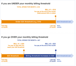
Facebook is always trying to streamline their processes and make things easier for them and you. If you have advertised with Facebook for a few years, you will remember the days of them billing your daily for their ads. Thank goodness those days are over. Facebook offers an ads payment plan where your account is billed once you spend a set amount. This plan, called a billing threshold, affects when and how often you are billed for ads. You still will be billed monthly if you do not hit your monthly billing threshold. See Facebook’s graphic below for a visual example.

blog1

Current billing thresholds options are at $25, $50, $250, $500, and $750. If you set a threshold, and later decide you want to lower it, you can change your settings in a few easy steps.

    1. Go to your Ads Manager and click on Billing. This should be at the top of your screen right under the ‘search’ bar

blog2


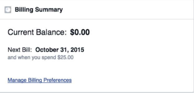
2. Under Billing Summary (far left underneath the Billing button), click Manage

blog3
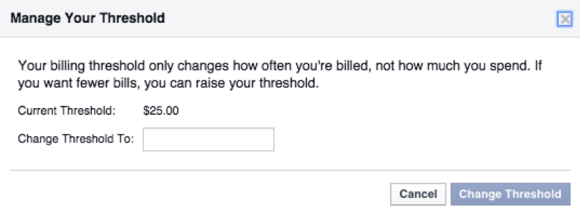
3. A new window should pop up. Enter a lower billing threshold amount and then click Change Threshold.

blog4

If you manage multiple ad accounts make sure you are looking at the correct account, but the threshold is nice because you can set separate amounts for different accounts and play around with different thresholds to see what works best for you.
Also, don’t confuse your billing threshold with your budget. These are two different concepts, your budget will limit your total monthly charges, which can impact if, when, and how many times your account reaches your billing threshold.

And remember, if you don’t want to spend your time dealing with this side of your business (or any other aspect of social media for business), we got your back! Alpine Small Business Solutions is here to handle any and every part of your social media management and business building needs.
Thank you for taking the time to visit our blog, we hope you enjoyed it. As a friendly reminder, please share this blog on your social networks (and comment below, we love hearing from you!).

This blog is brought to you by Alpine Small Business Solutions, Your Virtual Assistant and Online Business Manager Solution.